This rocks Magi. The only thing you could add imo is more roads and rooms to visit instead of just one straight way (especially since there is so much space on the top part)
Screenshot Thread
1 February 2006 - 8:54am
#53


1 February 2006 - 2:12pm
#54


Originally posted by indy@Feb 1 2006, 05:54 AM
This rocks Magi. The only thing you could add imo is more roads and rooms to visit instead of just one straight way (especially since there is so much space on the top part)
[post=196009]Quoted post[/post]
I had thought about it, but since it's the introductory dungeon I thought it would be better to make it fairly linear. :]
Thanks for the input though, everyone.
That, and Blitz appears to be everywhere at once.
I pieced the entire map together by taking screenshots in-game.

2 February 2006 - 2:36am
#55
I'd gathered that. I was trying to make a joke, and failed. .___.
About it being less linear, it doesn't matter if it's the first dungeon; it'd work a bit better if there were a few alternate ways to go. Not necessarily ending up at the same place, but possibly getting a treasure chest or something. It'll work a lot better in the end; most players love exploration. Those that do can reap the rewards, those that don't will just go on their merry way.
...It also depends on whether, like me, you're lazy. xD
4 February 2006 - 4:01pm
#56
Outdoor segments of the dungeon crawler. He'll have a shirt when I sprite it.
Some more of <span style='color:red'>level 2</span>
4 February 2006 - 4:15pm
#57
Yeah looks nice Maxy yeah. But o.o what's with that grey sprite up in the top left corner?
Oh. I guess I should submit something, hey?
I've been experimenting with little different ways to make the treetops look less boring... I think I've done an okay job so far, but I'll probably end up adding something like, tree tops sticking up out of the treetop autotile graphic. But I dunno yet. 

The treetop part that's growing out over the pathway is supposed to make it look more like... sorta like a tunnel through the forest, rather than an open pathway. I think the treetop overlay/shadow effect thing looks REALLY lame, which is why I'm not using it. Imo.

NOTE: The maps themselves aren't done yet >( don't judge them shutup. I'm mostly just focusing on the treetops atm imo.
4 February 2006 - 4:37pm
#58
Looks very interesting, Barry. I'm impressed!
The grey sprite at the top is the body temperature indicator. Changes colour depending on the conditions of the character. I intend to have lots of indicators on the HUD (they'll only appear when appropriate) as the puzzles in the dungeon will be based around the environment rather than anything silly like switches.
4 February 2006 - 4:40pm
#59

Thats nice- although the armlike sections do seem to look a bit iffy.
Still, the canopy messes with my eyes  .
.
4 February 2006 - 7:03pm
#60
Barry, you've improved so much. Great job.
Also, nice screens Maxy 
4 February 2006 - 8:10pm
#61
Maxy, looking better every time. My only suggestion for the first screen would be to drop the amount of... open-ness. I know that isn't a word. >_> I can understand that you'd want the player to have some amount of room, but it's all very empty. If anything, add some trees or SOMETHING there to fill up the blank bits. It'd just be nice, y'know?
Second screen, I've no worries with it...but... y'know, I hate it when people mix "smooth edges" with "sharp edges". I know I'm making, like, no sense at the moment, and I'll explain with a picture later, if you want.
Barry, very nice indeed. o.o The canopies confuse the hell out of me, but it's fine. Just make sure they don't go out too far from the original shape. Keep it vaguely linear, but enough to interest the player.
Goodness.
That made no sense.
4 February 2006 - 8:59pm
#62
Originally posted by Christophomicus@Feb 4 2006, 08:10 PM
Maxy, looking better every time. My only suggestion for the first screen would be to drop the amount of... open-ness. I know that isn't a word. >_> I can understand that you'd want the player to have some amount of room, but it's all very empty. If anything, add some trees or [b]SOMETHING there to fill up the blank bits. It'd just be nice, y'know?
[post=196163]Quoted post[/post]
[/b]
I actually think it being open like this is better, effective yet good looking, not cluttered with an insane amount of details, plus, seeing it's a dungeon crawler, and assuming you need to fight monsters, then I guess it is better like that. Also, I doubt every places in the world need to be awfully amazing to the eyes, and his setting doesn't seem to be the kind of place where you'd find a lot of vegetation and the like.

7 February 2006 - 7:37am
#63
Just a bit more progress on my tileset. I know, it seems like I'm taking forever on this thing, but I had to take a break from it to get some work done. Well now that I'm working on it again it will hopefully only take slightly less than forever.
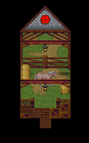
Fortunately the fact that I've made a new grass tile and mud auto-tile here for the stables means that I won't have to do them when I come to doing the outdoors equivalent of this set. 
And incase you aren't familiar with RMXP, the horse character isn't mine, it's the RTP. I just threw that in to make it look better.
Enjoy. ©
7 February 2006 - 12:17pm
#64
Looking very nice Inq! I especially like the sort of...fuzziness...of the crates.
As far as the map goes, I see no problems except the shadow above the horse's head.
7 February 2006 - 1:43pm
#65
@Maxy: They all look excellent. Well done! I also love the fuzziness.
@BBJ:Intresting use of the Tree Top Auto-Tile, Some areas look abit odd though. With the Snake looking bit going on to the lower cliff bit, also there's a tree overlapping abit of the cliff.
@Inq: Like i said at GW, Looks Terrific. Also like the way you made the stable entrance..
(In Game)

(Editors Mode)


<span style='color:orange'>::::::::::::::::::<span style='color:"Red"'>Projects</span>::::::::::::::::::[/COLOR]
Annora's Eye(<span style='color:"Red"'>25%Complete</span>)
7 February 2006 - 6:26pm
#66
Kick ass stuff there, Flare. I've forgotten how good you were.

y halo thar

east is a prety god pixle artist

imo

more world (new and improve)

is this <s>loli</s> valkyrie profile
7 February 2006 - 8:30pm
#67
Very nice, Magi. What town chipset is that?
7 February 2006 - 8:43pm
#68
Oh wow I love that chipset for the Town. I also love the world chipset.

7 February 2006 - 8:55pm
#69
Originally posted by Psygon@Feb 7 2006, 05:30 PM
Very nice, Magi. What town chipset is that?
[post=196411]Quoted post[/post]
Custom, by East.
7 February 2006 - 10:35pm
#70
Originally posted by TheInquisitor+Feb 7 2006, 06:37 AM--><div class='quotetop'>QUOTE(TheInquisitor @ Feb 7 2006, 06:37 AM)[/CENTER] Just a bit more progress on my tileset. I know, it seems like I'm taking forever on this thing, but I had to take a break from it to get some work done. Well now that I'm working on it again it will hopefully only take slightly less than forever. Fortunately the fact that I've made a new grass tile and mud auto-tile here for the stables means that I won't have to do them when I come to doing the outdoors equivalent of this set. And incase you aren't familiar with RMXP, the horse character isn't mine, it's the RTP. I just threw that in to make it look better. Enjoy. [/b] Awesome map Inq. I like the crate texture and the horse, although not yours, adds a nice touch. The one thing that bothers me is that the entrance with the window... it seems off. I don't know, it bothers me a bit. <!--QuoteBegin-Mr Flare
©[post=196365]Quoted post[/post]
@Maxy: They all look excellent. Well done! I also love the fuzziness.
@BBJ:Intresting use of the Tree Top Auto-Tile, Some areas look abit odd though. With the Snake looking bit going on to the lower cliff bit, also there's a tree overlapping abit of the cliff.
@Inq: Like i said at GW, Looks Terrific. Also like the way you made the stable entrance..
(In Game)
(Editors Mode)
[post=196381]Quoted post[/post]
Mr. Flare, those are really cool maps. I like the chipset a lot. If you could send it too me... I mioght be able to dabble in it's merits.
8 February 2006 - 5:03pm
#71
Nice screens:
Magi:
This town looks awsome, really cool, this chipset is truly great, but I think that the bottom right house of the third picture looks a bit weird, but that´s me, and the world map looks pretty nice too, the last image with that little pic looks amazing, congratulation.
Mr.Flare:
Those screens looks pretty good too, but I can´t understand them, but that is just me, I don´t like futuristics chipsets, but for this kind of chipset you impressed me, they looks quite nice!
TheInquisitor:
Wonderful work man, that tileset looks great, hope to see it released some day, keep working eh?
9 February 2006 - 2:58am
#72
This shot amazed me. Everything about it is done right.
9 February 2006 - 3:32am
#73
I LOVE how the cliffs continue into the water in your maps Magi.
9 February 2006 - 8:59am
#74
Who's world-map is that(who made it/ripped it)?
9 February 2006 - 9:44am
#75
Inq's I think.
9 February 2006 - 9:47am
#76
It's not mine. It's my favourite though and the composition I made took a few bits and bobs from it because it's my personal favourite as well. What it's from though, I do not know.
9 February 2006 - 9:48am
#77
Hmmm...Well, if its RM2K, I think it is the FF mythologies one- "FF6 Overworld".
9 February 2006 - 11:30am
#78
Looks like Chrono Trigger.
9 February 2006 - 11:54am
#79
It's neither Crono Trigger or FF6.
9 February 2006 - 7:02pm
#80
Yeah, looks hella not like Chrono Trigger and far to sleek for Final Fantasy Six
10 February 2006 - 8:14am
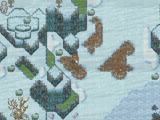
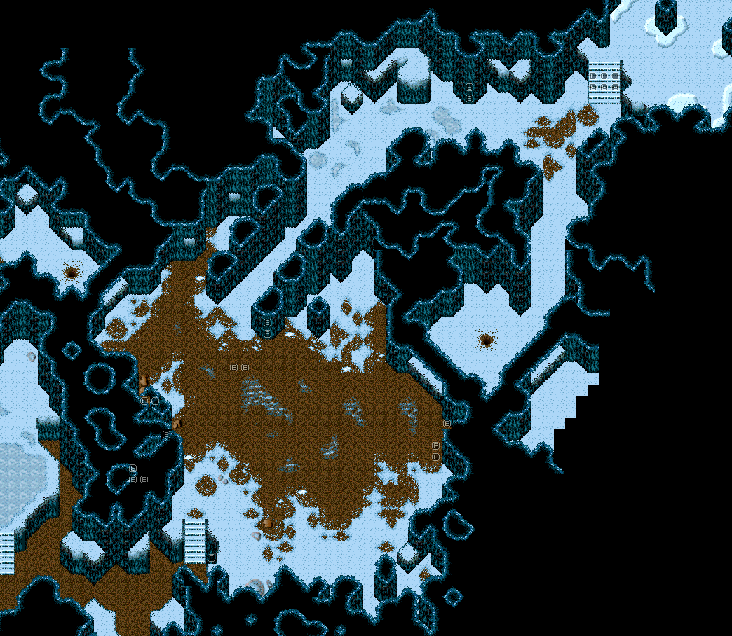
#81
So I got to work on doing a huge map.
Warning: It's BIG.
It's a mountain, yup. I used some of Magi's custom tiles, ripped from a Balmung chipset (plz dun kil me ;_;), and spent an hour or so fiddling around with the chipset before I got a combination of tiles I liked.
Then I went and mapped the thing. Probably won't ever see any use in a game, but yeah. I know it's a bit full, and some areas of it look like ass, but I gave it a shot. =/
Critique away.
Edit: Oh, water under the building is so the water could have a "constant source".
Oh, this too.
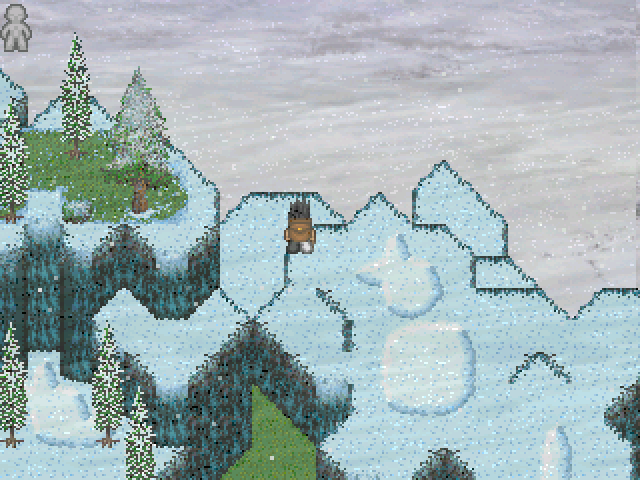
Just Inq's volcano chipset. The tiny bit in the middle-left is there for a reason.
10 February 2006 - 8:37am
#82
Wow, those are nice.
Volcano:
Very nice (that bit in the middle-left you mentioned is nice, makes it seem like part of a bigger area) but tow problems. Just right of the centre there is a low section which seems to be a 2D piece of land, floating on the lava, maybe give that some depth? Secondly, the bridges should extend or have poles holding them onto the cliffs at either end.
Mountain:
Perfect in my opinion, except that the waterfalls seem to end to abruptly, maybe add foam at the bottom and a sort of curving tile at the top?
10 February 2006 - 8:52am
#83
Alright, thanks. I'll look into it. The bit with the, uh, dirt with no depth: that was intended, 'cause I thought "Whoa. Way too many cliffs.". >_> I'll work on the bridges, though. I was going to use some steel ones, but couldn't figure out how to use them.
Thanks anyway, I'll look into your critiques. =D
10 February 2006 - 4:56pm
#84
Originally posted by Christophomicus@Feb 10 2006, 08:14 AM
So I got to work on doing a huge map.
Warning: It's BIG.
It's a mountain, yup. I used some of Magi's custom tiles, ripped from a Balmung chipset (plz dun kil me ;_;), and spent an hour or so fiddling around with the chipset before I got a combination of tiles I liked.
[post=196540]Quoted post[/post]
Those chipsets are ripped from Rudora No Hihou, so I doubt Magi would mind.
A nice map, but I believe someone will point out the stair mistake, cut off they be (not long enough).
10 February 2006 - 6:07pm
#85
Originally posted by ObviousDelirium@Feb 10 2006, 01:56 PM
Those chipsets are ripped from Rudora No Hihou, so I doubt Magi would mind.
A nice map, but I believe someone will point out the stair mistake, cut off they be (not long enough).
[post=196558]Quoted post[/post]
Half of all the resources I use are from Rudra (A game which I have barely played, I'd like to note.)
I like the mountain tileset/image a lot, it's pretty spiffy, and the design with Inq's volcano is good as well (I just never much cared for that tileset of his.)
10 February 2006 - 8:11pm
#86
Yeah. I noticed the stair error pretty much straight after I printscreened it. Oh well.
And thanks, Magi. ._.
25 February 2006 - 1:08pm
#87
Let's spice up the dead thread.
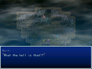
Screenie from Fallen Angel.
25 February 2006 - 1:38pm
#88
Originally posted by RpgmT@Feb 25 2006, 12:08 PM
Screenie from Fallen Angel.
[post=197399]Quoted post[/post]
Well that seems to be a really giant spider. Nice screenie.
27 February 2006 - 8:00pm
#89
I got bored.
ps. lol.
http://img503.imageshack.us/img503/523/forsilly0yr.jpg
It obviously would be more detailed if I was actually using it, but I just felt like making a "lighthouse" kinda map.
What, gonna judge me now?
UGH. YOU THINK I NEED THIS RIGHT NOW?!?!
DO YOU?!? ...
27 February 2006 - 9:26pm
#90
Lol that's a cute map Barry. Thanks for showing it to me prior to you posting it -_-x
I'm gonna try and be picky (even though you said it was just for silly. Well you know what? Screw you):
um heeeeelllloooooooo... I'm a little hesitant seeing some of those colourful flowers sprouting straight from the path that leads up to the lighthouse. A path that beaten would probably not sustain flower growth so... it just... it just seems a little awkward... yeah so overall just awful job because of that bye.

On hiatus. Blame holloway.
28 February 2006 - 5:02am
#91
Originally posted by RpgmT@Feb 25 2006, 06:08 PM
[post=197399]Quoted post[/post]
A spider... (just a random guess )
28 February 2006 - 6:56pm
#92
RpgmT, not too shabby. o.o I've not really got any critique.
Barry... that is... that is such an awesome map ;___;
1 March 2006 - 12:09am
#93
Originally posted by Blue Barry Jam@Feb 27 2006, 07:00 PM
I got bored.
ps. lol.
http://img503.imageshack.us/img503/523/forsilly0yr.jpg
It obviously would be more detailed if I was actually using it, but I just felt like making a "lighthouse" kinda map.
What, gonna judge me now?
UGH. YOU THINK I NEED THIS RIGHT NOW?!?!
DO YOU?!? ...
[post=197489]Quoted post[/post]
well, the landscape is pretty spiffy, I like it. but the tower bothers me. first off, the balcony doesn't seem to match the perspective of the rest of the tower. and I'm wondering whether there is a reason the tower is striped.
1 March 2006 - 4:25pm
#94
RpgmT: Do I spy a boss battle? Nice to have your monster actually appearing rather than a typical shaking screen "What's that monster?" moment.
BBJ: I must agree with Christophomicus. That's an excellent map, BBJ. You're certainly improving with it. For the first time you've producded atmosphere in a map, which is exactly where you want to be heading. The flower patches are excellent and well positioned so that you can make a fine looking area without excessively going into detail. You've only got one bit that I don't like there, which is the two pointless stone pillars. Replace those with a mini clearing in the forest (perhaps with a patch of dirt) and put the stone pillars in a more logical place i.e. near the lighthouse.
The best bit in my opinion is the dock. I like the way that it disappears behind the trees. If there's more of the map or a separate map that takes you down the cliffside, it'd be very funky indeed. Keep it up.
8 March 2006 - 6:35pm
#95
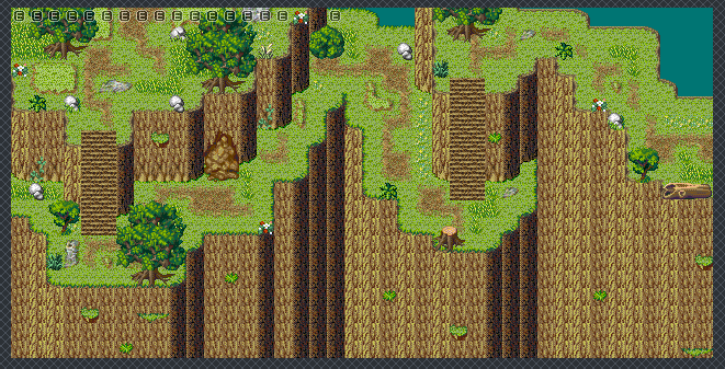
Been a bit slow, so I'll get this rolling.

Quick chipset test. Nothing spectacular. I'm well aware that the three colours of trees... don't make sense? I s'pose that's a way to put it. But bah. Comments and criticisms are welcome.
8 March 2006 - 10:25pm
#96
If you got rid of the pink trees it'd look alot better
9 March 2006 - 2:04am
#97

The reason why there are three different colours of trees is because they are ripped from 'Secret Of Mana': the name of the place escapes me, but there is a forest in which the seasons change from spring to summer and soforth. Not sure where the winter ones are, but the three colours there reflect the three other seasons, thus I suppose shouldn't be mingled! =D
9 March 2006 - 2:51am
#98
Actually, it looks quite nice- if you can explain, or make it feel normal, why there are pink trees then fine.
9 March 2006 - 5:33am
#99
I didn't include Winter because it looked REALLY out of place. The pink trees are JAPANESE CHERRY BLOSSOMS and are around a very asian-themed place. Glad to see you like it. o.o
9 March 2006 - 8:09am
#100
I like anything kooky like that. In my opinion, so long as it works, realism isn't that important.
16 March 2006 - 1:20pm
#101
Time to breath some live back in this topic! It always dies so quickly =(
Who's online
There are currently 0 users and 1 guest online.
Excellent, Magi, but the Stone Monolith thingies sorta clash a bit with the rest of the chip. Drain the colours on it a bit, add a sepia tone or something. Make it more browny-gray. They stand out as is.
That, and Blitz appears to be everywhere at once.